• Home
  • CV
  • Notes
  • Vis 📊

On this page

  • When(-ish) do people visit national parks?
    • Animating things
    • Final submission

US National Park Visits

misc
vis
Author

Sheng Long

Updated

January 24, 2026

As part of 2025 International Love Data Week, I participated in the Northwestern Visualization Contest.

About a year later I tried plotting using different visualizations with Sveltplot here.

Code
# set custom theme 
# selected_months <- c("Jan", "Mar", "Jun", "Sep", "Dec")
selected_months <- c("J", "M", "J", "S", "D")

# define the custom theme 
theme_custom <- function(base_size = 14) {
  theme_minimal(base_size = base_size) +
    theme(
      # Text elements
      axis.text.x = element_text(size = rel(1.1), color = "gray20", family = "Roboto", face="bold"),
      axis.text.y = element_text(size = rel(1.1), color = "gray20", family = "Roboto", face="bold"),
      axis.title = element_text(size = rel(1.2), color = "gray20", family= "Roboto"),
       plot.title = element_text(
        size = rel(1.3), 
        color = "gray20",
        hjust = 0.5,  # This centers the title
        family = "Roboto"
      ),
      
      # Grid customization
      panel.grid.minor = element_blank(),
      panel.grid.major.y = element_line(
        color = "gray85",
        linetype = "dashed",
        linewidth = 0.3
      ),
      panel.grid.major.x = element_line(
        color = "gray85",
        linetype = "dashed",
        linewidth = 0.3
      ),
      
      # Clean borders
      axis.line = element_line(color = "gray20", linewidth = 0.3),
      
      # Remove background elements
      panel.background = element_blank(),
      plot.background = element_blank()
    )
}

theme_set(theme_custom())

When(-ish) do people visit national parks?

We first load the data obtained from https://www.responsible-datasets-in-context.com/posts/np-data.

df <- read.csv(file = "US-National-Parks_Use_1979-2023_By-Month.csv") %>% 
  tibble(.) %>% 
  mutate(ParkName = str_remove(ParkName, "NP.*$")) |>
  mutate(ParkName = trimws(ParkName)) %>% 
  mutate(Region = trimws(Region))

knitr::kable(head(df))
ParkName UnitCode ParkType Region State Year Month RecreationVisits NonRecreationVisits TentCampers RVCampers Backcountry
Acadia ACAD National Park Northeast ME 1979 1 6011 15252 102 13 0
Acadia ACAD National Park Northeast ME 1979 2 5243 13776 53 8 0
Acadia ACAD National Park Northeast ME 1979 3 11165 15252 176 37 0
Acadia ACAD National Park Northeast ME 1979 4 219351 37657 1037 459 0
Acadia ACAD National Park Northeast ME 1979 5 339416 50616 3193 1148 0
Acadia ACAD National Park Northeast ME 1979 6 543205 70776 23821 9819 0

My first attempt was to plot a small multiples plot of the monthly average RecreationVisits to see what the general trend looks like:

df %>% select(UnitCode, Year, Month, RecreationVisits) %>%
  group_by(UnitCode, Month) %>% 
  summarise(avg_rec_visits = round(mean(RecreationVisits))) %>% 
  ggplot(aes(x = Month, y = avg_rec_visits)) + 
  geom_line() + 
  facet_wrap(~UnitCode) + 
  scale_x_continuous(breaks = 1:12, labels = 1:12) + 
  scale_y_continuous(labels = function(x) paste0(x/1000, "K")) + 
  theme_custom()

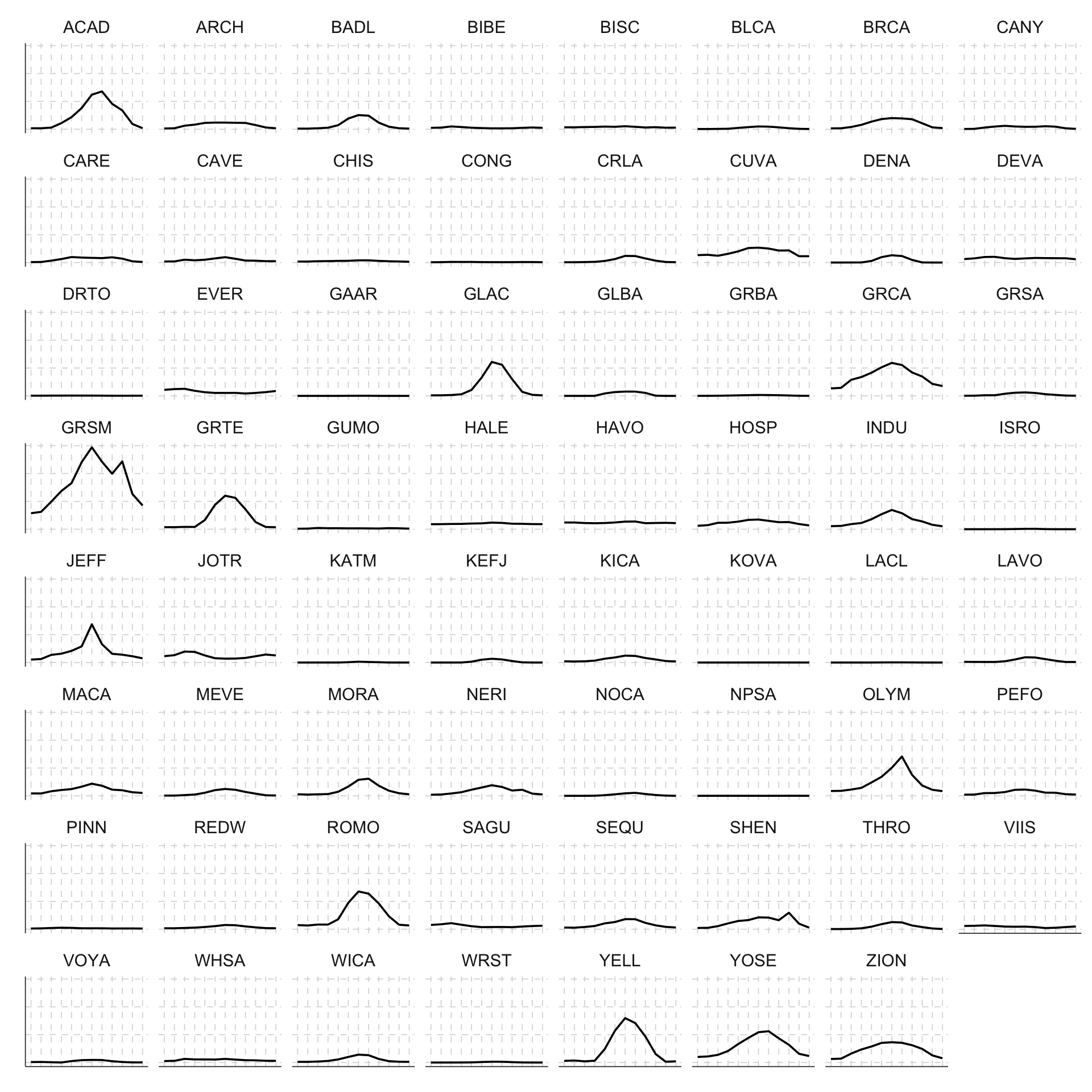
Clearly some of the really popular national parks (such as Yellow Stone YELL, Yosemite YOSE) have average monthly visits on a entirely different scale than some of the other national parks. To plot seasonal patterns better, we could first calculate the average monthly visits, then “scale” the monthly visits to be percentage of the maximum average monthly visit.

df %>% select(UnitCode, Year, Month, RecreationVisits) %>%
  group_by(UnitCode, Month) %>% 
  summarise(avg_rec_visits = round(mean(RecreationVisits))) %>% 
  group_by(UnitCode) %>% 
  mutate(pct_of_max = avg_rec_visits / max(avg_rec_visits)) %>% 
  ggplot(aes(x = Month, y = pct_of_max)) + 
  geom_line() + 
  facet_wrap(~UnitCode) + 
  scale_x_continuous(breaks = 1:12, labels = 1:12) + 
  theme_custom()

A part of me wants to create a joy plot/ridge line version of this graph but that’s a challenge for later after I figure out how to use OJS with Quarto…

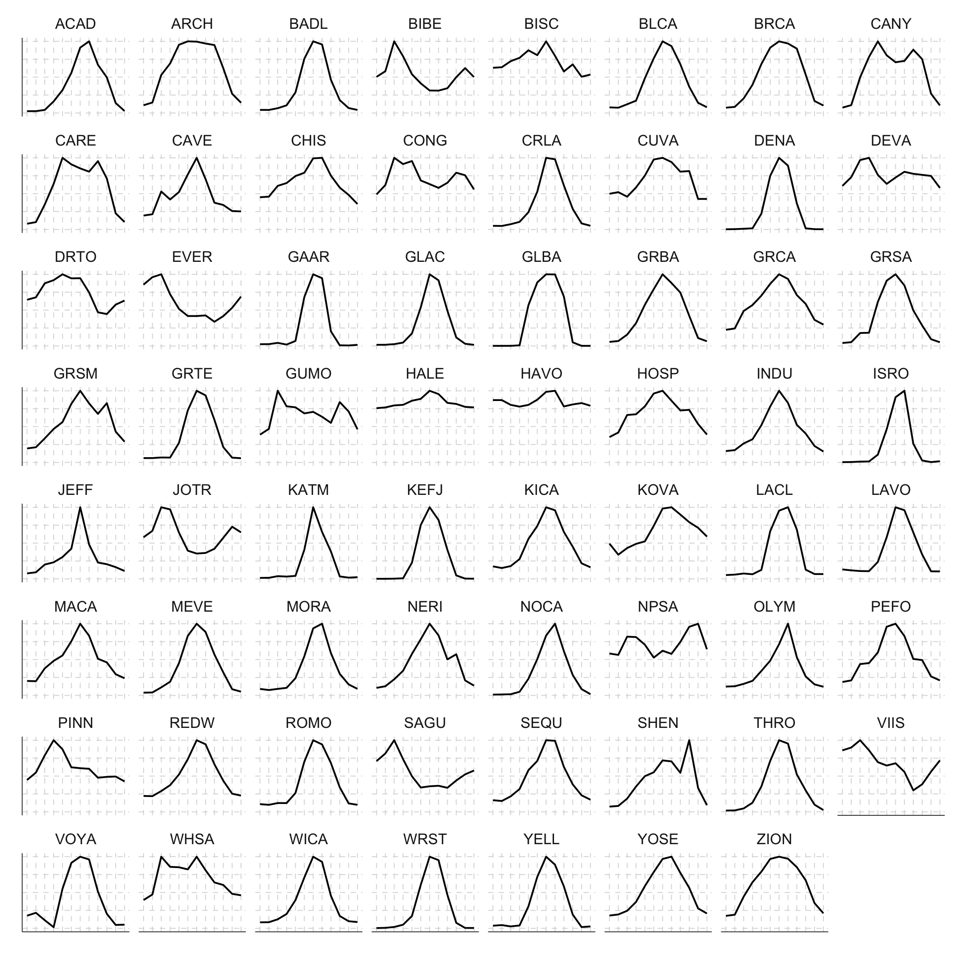
This graph gives a better sense of what are the seasonal variations in visit patterns across national parks. But it also glosses over a lot of details happening over the years. That’s when I thought maybe an animated version of the monthly visit data across the years could be something cool to try out.

Animating things

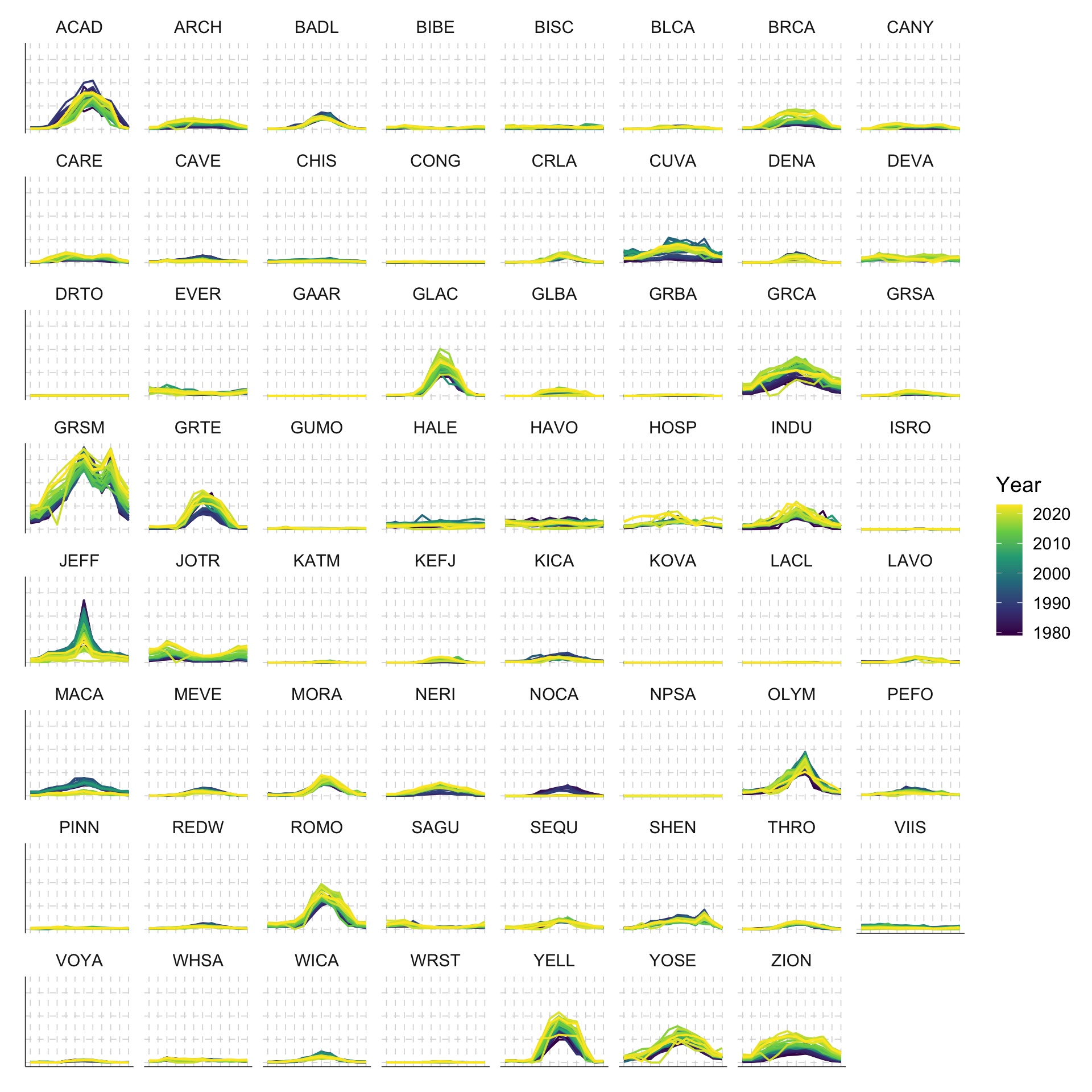
First, if we were to plot everything out all at once, what would it look like?
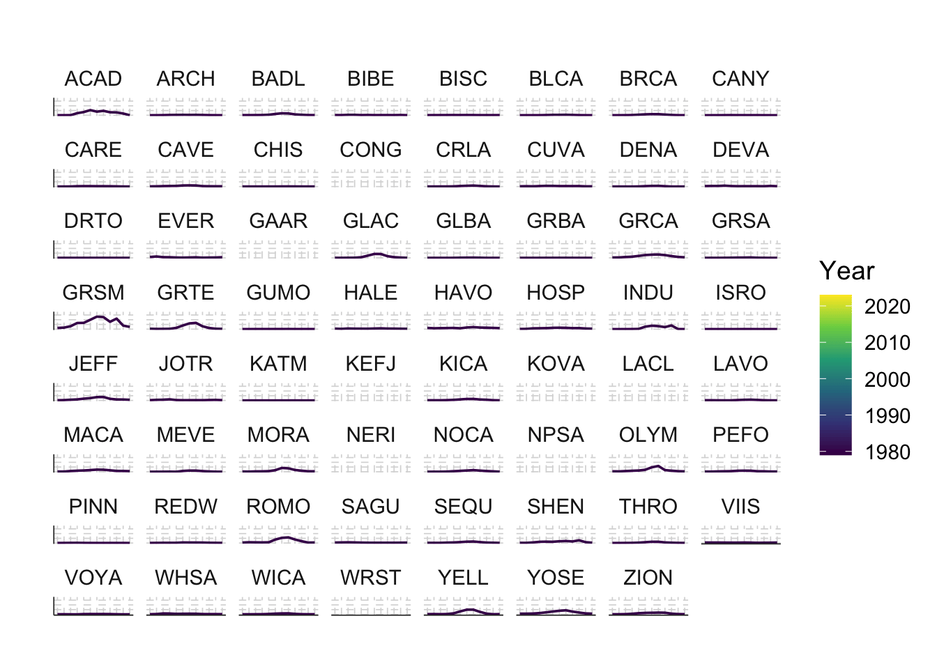
df %>%
  ggplot(aes(x = Month, y = RecreationVisits, color = Year, group = Year)) +
  geom_line() +
  facet_wrap(~UnitCode) +
  scale_x_continuous(breaks = 1:12, labels = 1:12) +
  scale_color_viridis_c() + 
  theme_custom()

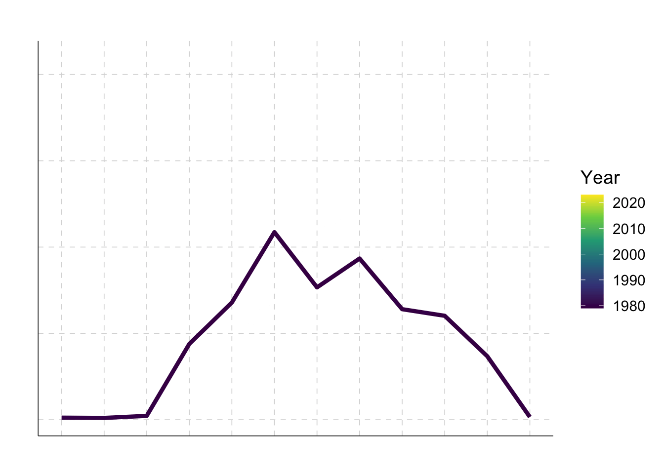
We can make it animated by using the gganimate package. Let’s first start with a single national park, say Acadia ACAD:

df %>% filter(ParkName == "Acadia") %>%
  ggplot(aes(x = Month, y = RecreationVisits, color = Year, group = Year)) +
  geom_line(linewidth=1.5) +
  scale_color_viridis_c()+
  scale_x_continuous(breaks = 1:12, labels = 1:12) +
  scale_y_continuous(labels = function(x) paste0(x/1000, "K")) +
  labs(title = 'Year: {frame_time}') +
  transition_time(Year) +
  shadow_mark(past = T, future = F, alpha = 0.1) + 
  theme_custom()

We can also do this for the entire set of national parks:

df %>%
  ggplot(aes(x = Month, y = RecreationVisits, color = Year, group = Year)) +
  geom_line() +
  facet_wrap(~UnitCode) +
  scale_x_continuous(breaks = 1:12, labels = 1:12) +
  scale_color_viridis_c() +
  scale_y_continuous(labels = function(x) paste0(x/1000, "K")) +
  labs(title = 'Year: {frame_time}') +
  transition_time(Year) +
  shadow_mark(past = T, future = F, alpha = 0.1) + 
  theme_custom()

There are a lot of things happening at the same time … What if I want to identify outliers? What if I want to know whether geographically close national parks are going to have similar visitation patterns? This is why I built the interactive version.

Final submission

© 2024 Sheng Long


This website is built with , , Quarto, fontawesome, iconify.design, and faviconer.